How I Built My Frontend Developer Portfolio with Astro
At some point every frontend developer ends up rebuilding their portfolio.
That was definitely true for me.
I wanted a site that could do a few things at once:
- present my work clearly
- feel personal rather than template-driven
- stay fast and lightweight
- give me room to experiment with small dynamic features
- be easy to maintain without turning into a full CMS project
I also wanted the site to feel visually playful and immediately recognizable.
Not just fast.
Not just clean.
Not just “professional” in the generic portfolio-template sense.
For this version of my site, Astro ended up being the right fit.
It gives me the simplicity of a static site, but still leaves room for interactive sections, reusable components, and content-driven pages like the blog, projects page, reading lists, and Now page.
This post is a walkthrough of how I approached the portfolio and why Astro works so well for this kind of frontend developer website.
Why I chose Astro for my portfolio
I did not need a heavy application framework for a portfolio.
Most of the site is content-first:
- homepage sections
- project writeups
- blog posts
- an About page
- a Now page
- image-heavy presentation
That makes Astro a very natural choice.
What I wanted from the stack
- static output for speed and simple hosting
- component-based structure for reuse
- good image handling
- the ability to sprinkle in JavaScript only where needed
- enough flexibility for custom layouts and interaction design
Astro checked all of those boxes.
For a portfolio, that matters because the site should spend most of its energy presenting the work, not shipping unnecessary client-side code.
The overall structure of the site
The portfolio is split into a few main content areas:
- a modular homepage
- a dedicated projects page
- a blog
- a personal About page
- a Now page for current interests and experiments
- a renders page for visual work
Instead of building the whole homepage as one giant block, I broke it into reusable Astro components and section-level content blocks.
That made it easier to evolve the layout over time without losing control of the design.
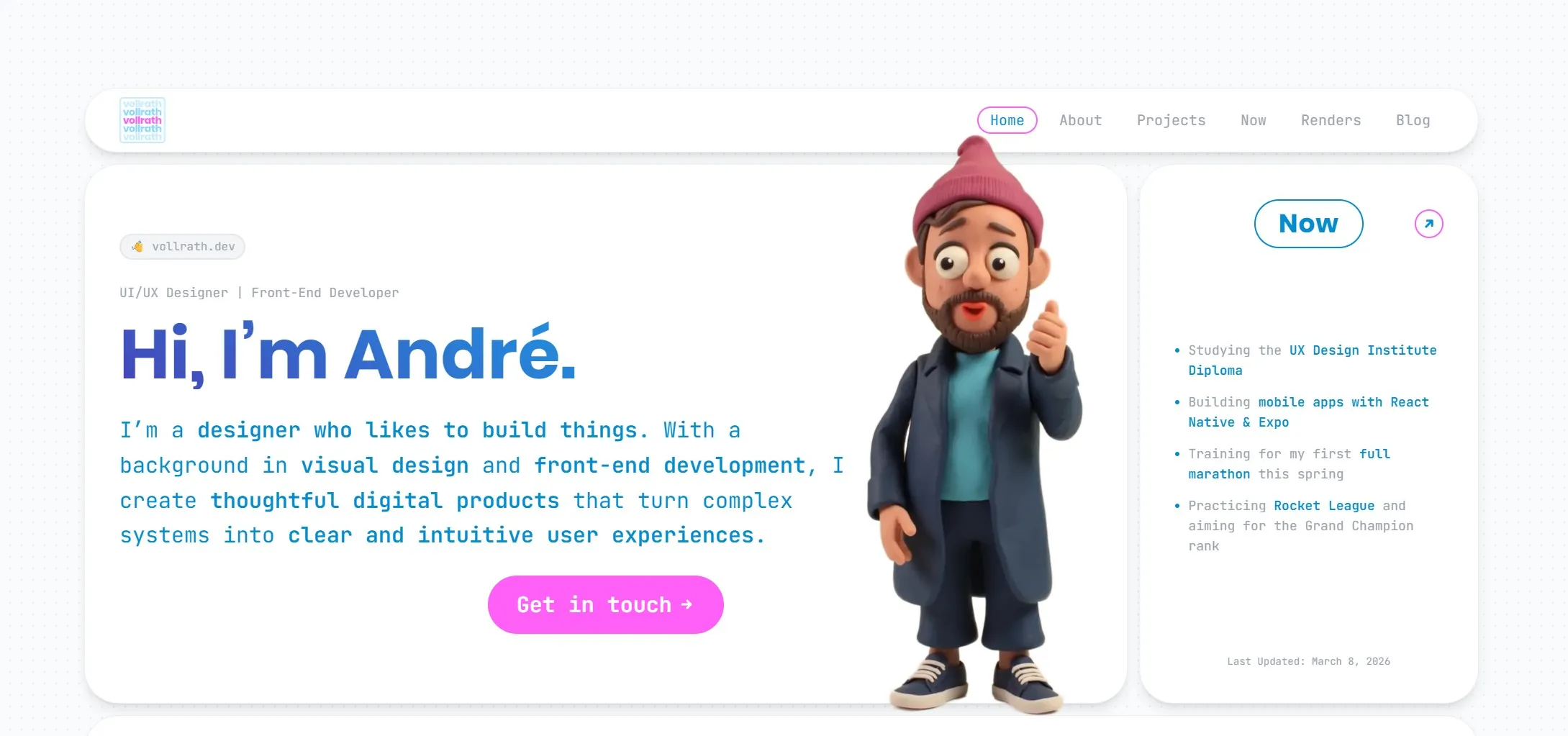
The homepage itself is built around a bento-grid-like layout, where each section acts like its own card with a clear role, but still contributes to one larger composition.
That structure turned out to be a really good fit for a portfolio, because it let me show multiple sides of my work at once without making the page feel cluttered.
Building the homepage as a system of sections
The homepage is not just a static hero plus a list of links.
I wanted it to feel like a compact overview of who I am, what I build, and what I am currently exploring.
So I structured it as a collection of focused sections:
- intro / hero
- client logos
- Now section
- latest blog post
- About section
- latest render
- Spotify top tracks
- tech stack
- links
- contact
- location
That gives the page a more editorial feel than a standard portfolio template, and it lets different parts of my work and personality show up without forcing everything into one paragraph.
Because each section is componentized, I can tune or replace individual parts without redesigning the whole site from scratch.
Visually, the homepage is intentionally arranged like a playful bento board:
- large rounded cards
- strong whitespace between blocks
- a soft, light background
- bold blue typography
- pink accent buttons and highlights
- outlined section headers that repeat across the layout
That repeated card language helps the page feel cohesive, even though the content blocks are quite different from one another.
Making the landing page feel playful instead of generic
This was one of the most important design goals.
A lot of portfolio sites are technically fine, but visually forgettable. I wanted the homepage to feel more alive at first glance.
A few choices helped push it in that direction:
- a large hero headline with a lot of personality
- a stylized 3D avatar instead of a standard headshot
- bright accent colors used sparingly for emphasis
- a mix of text cards, image cards, media cards, and utility cards
- subtle interaction design that makes the page feel responsive without becoming noisy
The result is much closer to a designed interface than a simple portfolio landing page.
That distinction matters to me because my work sits between frontend development and visual design. The homepage should reflect both.
Mixing static content with small dynamic features
One of the things I like most about Astro is that it lets me keep the site mostly static while still adding selective dynamic features where they add personality.
A few examples from my site:
- a Spotify Top 10 section fed by API data and cached locally
- Favorite Books and Now reading sections driven by JSON data
- a latest blog post block that resolves post metadata automatically
- interactive homepage details like hover states, lazy-loaded media, and animated elements
This is the kind of balance I wanted.
The core content is stable and fast, but the site still feels alive.
Keeping performance in mind from the start
Performance matters a lot for a portfolio site.
It affects first impressions, mobile usability, and how polished the whole experience feels.
Astro helps by default because it ships less JavaScript than many app-first frameworks, but I still tried to be deliberate about the details.
A few choices that helped
- static generation instead of runtime rendering
- image optimization through
astro:assets - lazy loading where appropriate
- local caching for some external data and media
- only loading interactive scripts where the experience actually benefits from them
That approach keeps the site visually rich without making it feel heavy.
Using Astro components to keep the design maintainable
The visual side of a portfolio usually changes a lot over time.
That is another reason I wanted a component-based structure.
Sections like:
FavoriteBooksNowBooksProjectRenderSidebarSEO
can all evolve independently.
That makes the codebase easier to work with because visual experiments do not automatically turn into layout chaos.
It also means I can reuse content patterns across the site instead of duplicating markup every time I want to present a project or media block.
Designing the site to feel personal
A lot of developer portfolios feel interchangeable.
They often have:
- the same headline structure
- the same grayscale palette
- the same cards
- the same “about / projects / contact” rhythm
I wanted mine to feel more personal and slightly more playful.
That came through in a few ways:
- a bento-grid homepage that feels curated instead of linear
- stronger visual contrast between sections
- a homepage that feels more like a curated board than a landing page template
- repeated rounded card shapes and outlined headers that tie the whole page together
- large typography paired with softer secondary text
- animated and interactive details that support the personality of the site
- content blocks that reflect real interests like books, music, running, and 3D work
Since my background sits between design and frontend development, it was important that the portfolio reflected both sides instead of reading like a pure engineering resume.
The screenshot of the landing page makes that easier to explain than words alone: it is intentionally structured, but it is also intentionally playful.
Why Astro works well for frontend developer portfolios
I think Astro is especially good for portfolios when:
- most pages are content-driven
- performance matters
- you want full control over markup and styling
- you want some dynamic pieces, but not a full client-rendered app
That is exactly the shape of my site.
I can write regular Markdown posts, render project pages with custom components, optimize images at build time, and still add custom scripts for interactions when I want them.
It feels lightweight in the right places and flexible in the places that matter.
What I would recommend if you are building one yourself
If you are building a frontend developer portfolio with Astro, I would keep a few things in mind:
Start with content structure before visual polish
Figure out the main sections first:
- what should the homepage prove
- what belongs on dedicated pages
- what should be evergreen
- what should be easy to update
That makes the design decisions much easier later.
Build around reusable content blocks
Even if the site is small, repetition appears quickly.
Reusable components make it much easier to keep the site coherent while still evolving the look over time.
Use dynamic features sparingly
A few thoughtful dynamic touches can make a portfolio feel memorable.
Too many can make it feel unfocused.
I found it better to keep most of the site static and use interactivity as an accent.
Treat performance as part of the design
Fast loading, optimized images, and a clear structure are not just technical wins. They shape how polished the site feels.
Give the layout a strong visual system
One thing that helped a lot on my own site was committing to a recognizable visual system early:
- rounded card containers
- repeated section labels
- a small set of accent colors
- one clear typography direction
- consistent spacing between modules
That gave me room to make the homepage expressive without making it feel chaotic.
What I like most about the result
The thing I like most is that the site feels close to how I work.
It is structured, but not sterile. It is personal, but still professional. It gives me room to write, experiment, showcase work, and keep improving the experience in small increments.
That is exactly what I wanted from a portfolio.
Astro did not design the site for me, but it gave me a very good foundation for building something that feels fast, flexible, and distinctly my own.
Final thoughts
If you are building a frontend developer portfolio with Astro, I think the framework is a strong choice.
It is especially good when your site sits somewhere between:
- portfolio
- blog
- project archive
- personal playground
That combination describes my site pretty well.
For me, Astro made it easy to keep the portfolio fast and maintainable while still leaving enough space for design, experimentation, and small personality-driven features.
And for a personal website, that balance matters a lot.