
TalentAdore Mobile App
TalentAdore Mobile App was a UX prototype for the mobile version of a recruitment ATS. The desktop product is complex by necessity. The question the prototype had to answer was: what actually survives being used on a phone?
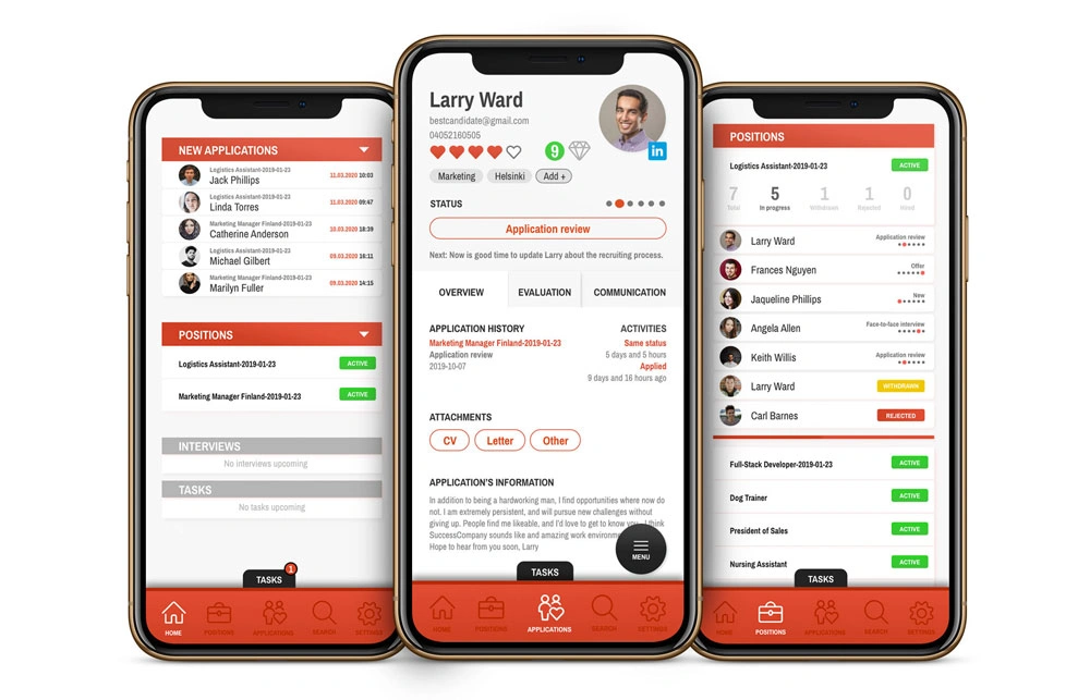
The reduction problem
A shrunken desktop product looks complete and works badly. A recruiter away from their desk isn’t running deep pipeline audits — they’re checking a candidate name, reading a quick message, or moving someone to the next stage. The useful work was deciding what that short list of actions is, and building around it.
The hierarchy problem in recruitment software is that almost every label feels important: candidate name, role, stage, evaluation state, message state, ownership, deadline, next action. On mobile the interface has to be more opinionated. Otherwise it becomes a tiny version of the desktop UI, which helps nobody.
The prototype also had to imply workflow continuity — a recruiter might check a candidate on mobile, but the deeper work probably continues later on desktop. The mobile view needed to make state understandable without pretending it owns the whole process.
The deliverable
A high-fidelity Adobe XD prototype, not a production frontend. That was the right deliverable because the question was interaction direction, not implementation architecture. Iterating in the prototype stage is much cheaper than discovering the hierarchy was wrong after a frontend build.
Where it stands
If I did this now I’d design closer to a component system and document the state model more explicitly. Mobile prototypes can look clean while quietly avoiding empty states, long names, permissions, and message edge cases. The project’s value in the portfolio is that it shows product thinking over implementation weight — the hard part was saying no to most of the desktop product.