

Sushi-san Website
Sushi-san Website was one of my first real client projects — a site for a local Helsinki sushi restaurant. The main lesson it taught me: restaurant websites should answer practical questions before trying to be clever.
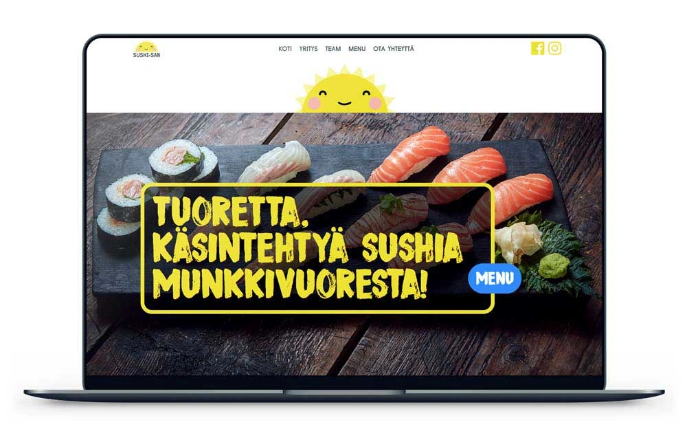
What it needed to do
When someone visits a restaurant site they have a few specific questions: what do they serve, where are they, are they open? The job is to answer those quickly. The biggest risk for this kind of site isn’t lack of technical ambition — it’s making the page harder to use than the business needs.
I used the brand’s existing colour palette and imagery to give the site atmosphere without adding friction. Menu and location information was front and centre.
The stack was the right choice
No framework, no CMS, no build system. Just HTML and CSS. For a small business with stable content, that’s often the most maintainable option — nothing to update, nothing to break between versions, nothing that requires a developer to be on call when the hosting environment changes.
There’s no standalone repository with a clean commit history. This was early client work, and the useful thing it records is the point where design stopped being an exercise. A real client had a real need, and the page had to be useful to normal visitors.
Where it stands
If I built the same site now I’d be stricter about semantic sections, alt text, restaurant structured data, and performance budgets. I’d probably reach for Astro so the static output stays simple while the authoring experience improves.