


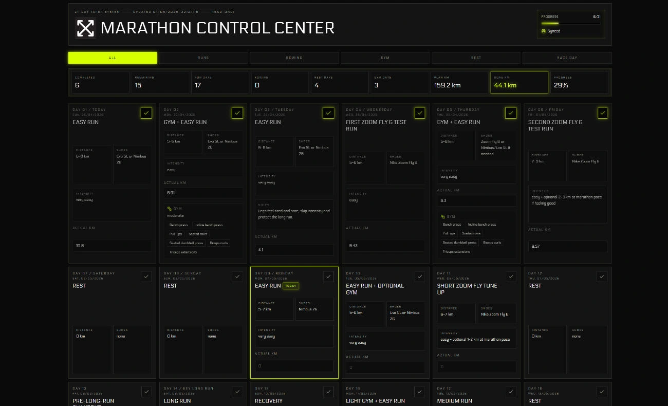
Marathon Control Center was a panic build completed three weeks before my first marathon. My training history was scattered across too many apps, and I had no clear view of whether the taper block was going according to plan. I didn’t need a generic fitness tracker; I needed something narrow that answered exactly the questions keeping me up at night.
What it actually asks
The app is scoped tightly to the high-stakes weeks before race day:
- Am I following the taper plan?
- Am I overdoing it with cross-training?
- Are the shoes holding up?
- Is my actual mileage close enough to the plan?
If every metric is visible, none of them matter. Keeping the scope that narrow meant the dashboard was actually useful rather than another thing to manage.
The build
React, TypeScript, Vite, Tailwind CSS, and optional Supabase sync. The .env.example points to Supabase, but sync is a convenience, not the core feature. The primary design constraint was speed of use: log something quickly, see the taper state immediately, and keep it personal rather than architecting it toward SaaS.
Where it stands
If I rebuilt it I’d separate reusable fitness primitives from marathon-specific copy and add a cleaner export format. The narrowness I’d keep — the useful part was that it matched one concrete situation exactly.